What We Do
Automated Variance Analysis
High Level Comparisons are Not Enough.
The simplest analysis is comparing headline numbers. Revenue increased from $100m to $115m. A good place to start, but not helpful in understanding why the change.
Drill down and you may see that Product #1 revenue increased by $8m, and Product #2 decreased by $5m. That is a helpful, but we can do better.
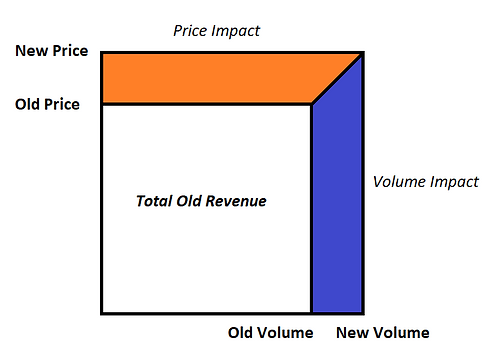
Price / Volume Variance Analysis is What You Want
Best practice is to split out price and volume impact. Product #1 has a higher volume impact of $6m plus a price impact of $2m.
Now we are getting somewhere. This is information that we can use to make impactful decisions.
Click Here to learn more about the math.
Note: picture below is explanatory, and is not output from the analysis.
How to Explain Changes in Average Per Unit
Popular Key Performance Indicators (KPIs) are Average Revenue per Unit and Average Cost per Unit.
Revenue per Unit was $100 but is now $115. Why? Using our analysis you can see how price movements and changes in mix impacted the overall average.
For example, Product #1 may have had little impact on Average Revenue per Unit. But an increase in volume share for Product #2 had a significant impact on Average Revenue per Unit.
Click Here to learn more about the math.
Note: picture below is explanatory, and is not output from the analysis. However, you may use the numerical output from the variance analysis with our "Create Waterfall" feature to make a chart for yourself.
